
It’s so hard these days to get people’s attention. And even harder to hold it!
But one marketing tactic seems to be attracting and holding people’s attention surprisingly well…
Webinars.
According to ON24, webinars are on average viewed for more than 55 minutes!
But before you can hold your webinar, you need to convert your target audience into attendees.
To do that you’re going to need a high-converting landing page. The design should convince visitors of the value and drive registrations for your webinars.
I’m going to walk you through 10 of the best webinar landing page examples and give you tips on what to do, what not to do. So you can create your own templates for success.
Let’s get to it!
Instapage
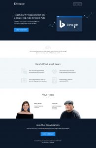
Why this one of the best webinar landing page examples
- The headline and subheadline – These convey a clear and strong benefit of the webinar USP and why the target audience would attend
- No Navigation – There is no easy opportunity to click out of the page so visitors are more likely to stay and read
- Layout – Unsurprisingly from a landing page builder, the design is well organised, and you can tell it is a high-converting template
- Direct marketing copy – The content says as much information to convince but isn’t too wordy or dense
- Sign up button – The button has the perfect contrast to attract the eye and make a visitor click
- Imagery – The headline image and icons are well designed so it feels professional
- Responsive – The page looks great on mobile and desktop
What could be improved
- Lack of detail – They could’ve expanded more on the webinar details to give a better picture on what you’ll get out of it
- Registration popup – The popup is bland and could be more enticing to click though
- The page is sparse – Space is good but it would be better to condense the template
Page load time: 3.7 seconds. Not great for a landing page, especially from a company whose product is a landing page builder!
Intercom
What this page gets right
- Webinar Title – This conveys a clear action and benefit which is powerful
- Bulleted lists – lists clearly show what you’ll get out of the webinar which is vital to get people to attend
- Copy – The messaging uncovers pain and shows how the webinar will solve it
- Registration form – Short and sweet and asks for only business email addresses
What could be improved
- Hero Heading – The heading should always be in the hero section above the fold.
- First CTA asks for details – Very presumptuous to prioritise asking to sign up ahead of the headline for the webinar.
- Outlinks in Left navigation – There are many ways you can leave this page which makes it so easy to click off.
- Footer links – Webinar landing pages don’t need a footer, they’re another way a user could click out
- Host images – These hosts images are very small so lack a personal feeling for the presentation
Page load time: 8.3 seconds! Wow that is slow and needs some drastic improvement.
Slack
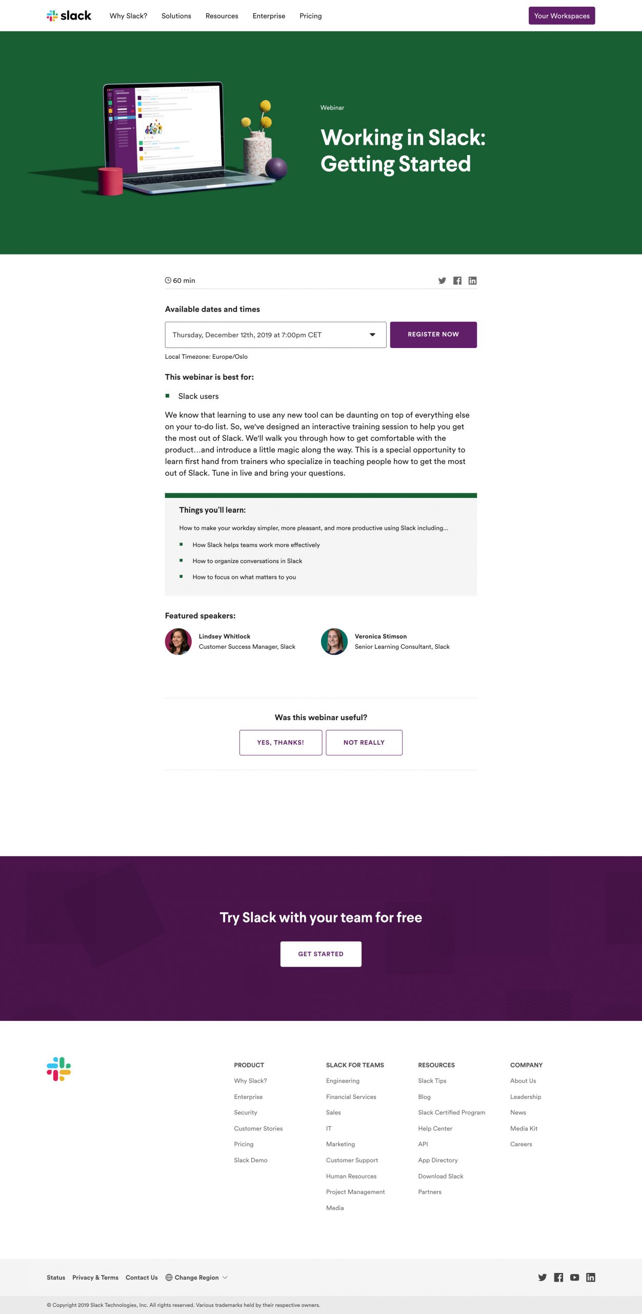
What this page does well
- Webinar Title – The title is direct and to the point, so you know in an instant what the webinar is about
- Who it is for – This clearly identifies the webinar target audience and qualifies people out. But most importantly it qualifies people in! If this is your job then you’ll ith it. This definitely helps for conversion
- What you’ll learn section – I like that this is in its own clearly visible section
- Copywriting – The copy flows seamlessly and makes it very easy to read
- CTA button – The button contrasts well with the page, making it very clickable
What could be improved
- Registration flow – Clicking “register now” redirects you to a second sign up page within the webinar software. Not ideal to say the least and should all be on one page
- Block of text – The central paragraph could be broken up to be more easily digestible
- Opportunity to click out – There are many outlinks from the page,
- Slack sign up button – The page should have one single call to action
- Layout – This isn’t a page you would want to send paid traffic from the likes of Facebook ads as it’s quite bland
Page load time: 5.6 seconds. Not awful, but not ideal either.
Make sure to check out our post on the best time and day for webinars
Marketo
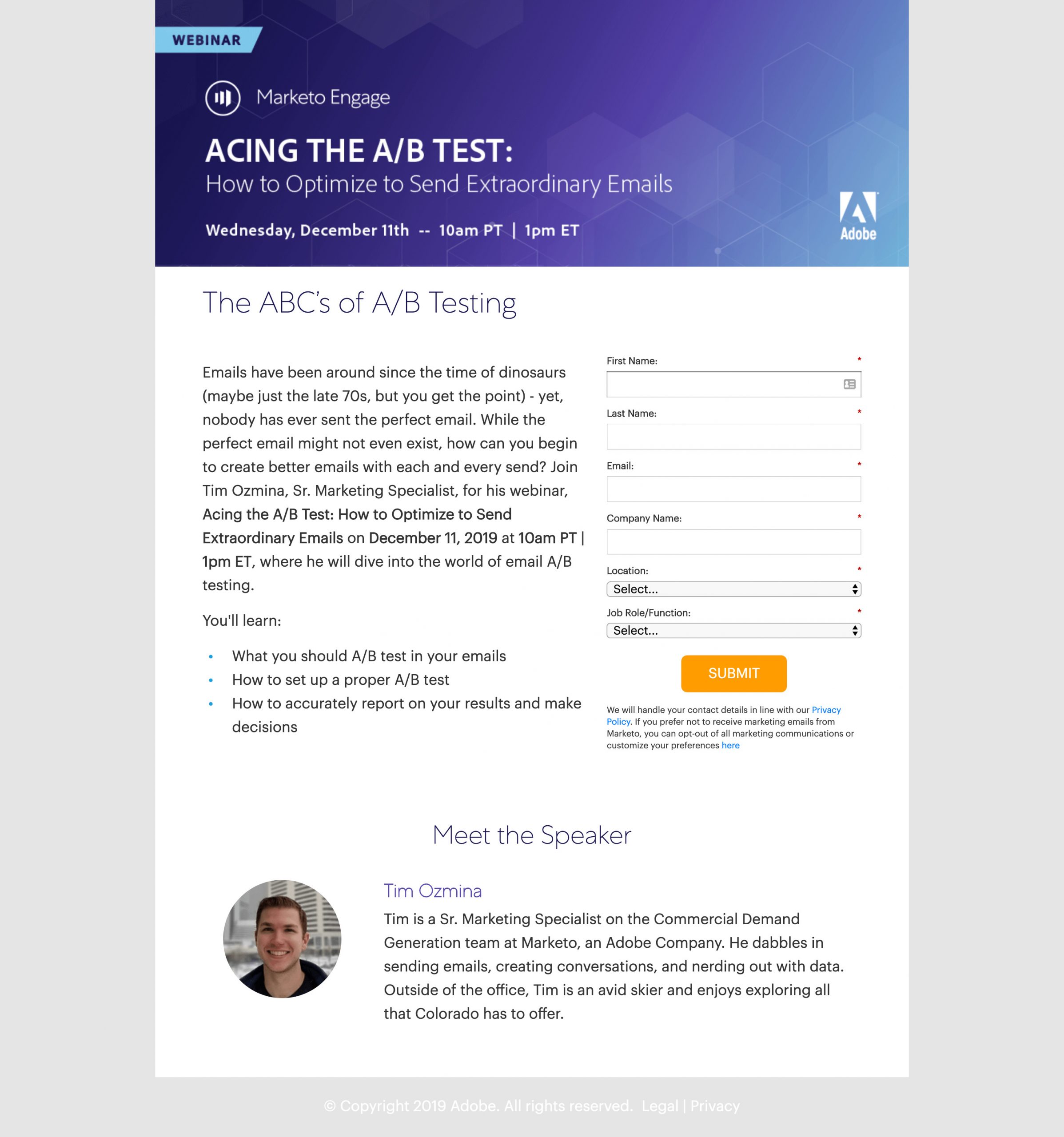
Why this is a great webinar landing page example
- No header navigation – There is no easy way to exit the page
- Page length – It covers everything necessary about the webinar and no more
- Bulleted benefits – It’s clear to see what you’ll get out of the webinar and the webinar USP
- CTA button – The button stands out well and makes you want to click
- Meet the speaker – The bio and image are personable and help you get to know Tim and his knowledge he can share
What could be improved
- Paragraphs – That is one bulky block of text. Breaking the body copy up into sections would make it much easier to read
- Registration form – Bland and looks like an uncustomized form
- Responsiveness – The page doesn’t scale well at all on mobile. This is a killer given how much traffic is currently mobile
- CTA button – “Submit” is generic and not enticing to click at all which can impact registrations
Page load time: 3.6s, another decent time.
Be sure to check out our post on the best time and day for webinars to make sure you’re hosting your webinar to maximize attendees!
Hubspot
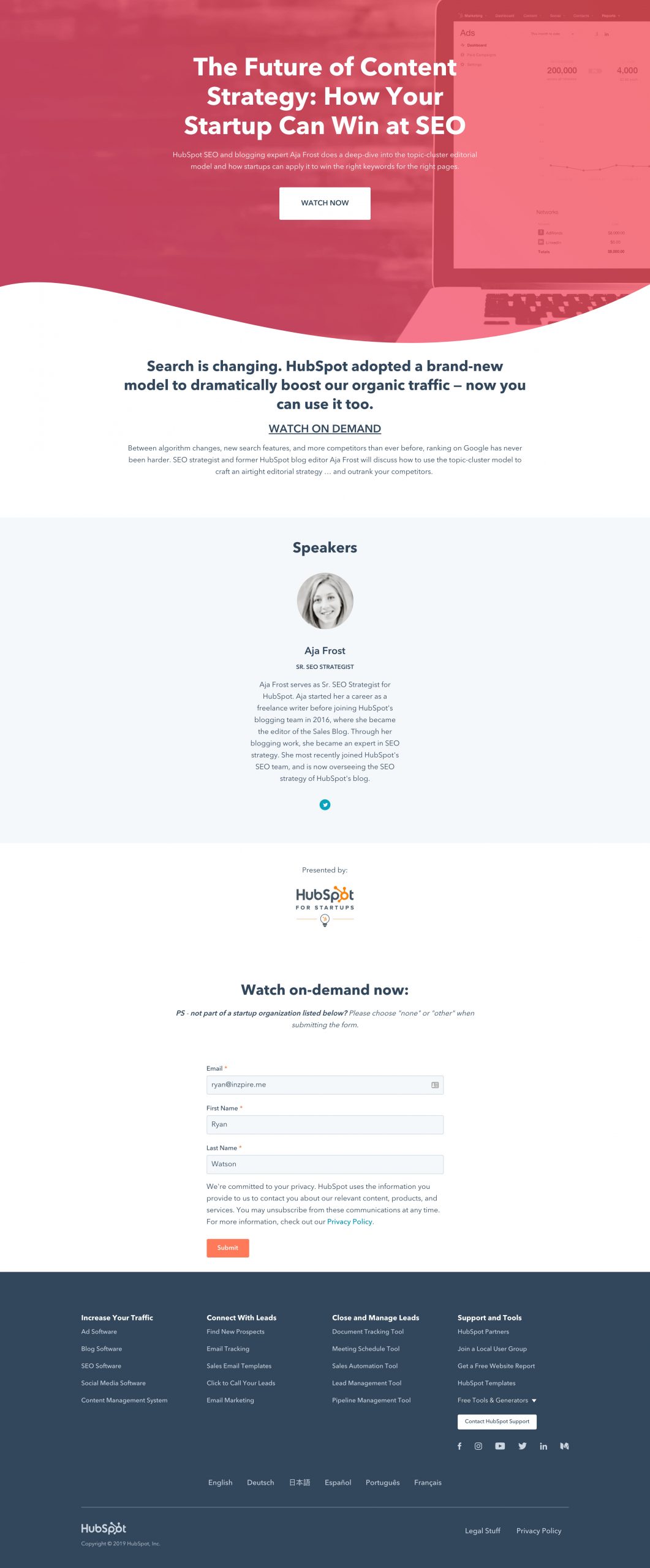
Why this landing page design is strong
- No header nav – This makes a user scroll down the page
- Clever copywriting – Everyone knows Hubspot dominates Google Search. They use this awareness to convert users with clever marketing copy
- Mobile responsive – You can tell from the spacing that this page is set up to be mobile-first. So no surprises that it looks great on mobile
- Auto populating form-data – The form auto filled out my data from their database. This breaks down another barrier for signing up
- Host detail – The detail about the host gives you confidence in the content of the webinar and makes you feel like it’s worth attending
What could be improved
- CTA button – The button is very small, bland and really doesn’t entice you to click
- Site footer links – Plenty of chances to leave the page and not sign up.
- Lacking Specificity – The marketing copy doesn’t say exactly what you’ll learn or get out of the session. They describe it in a high-level way which doesn’t sound actionable or useful
- Watch now button – A colour that contrasts the red and white would make it stand out more
Page load time: A solid 2.7 seconds load time.
Semrush
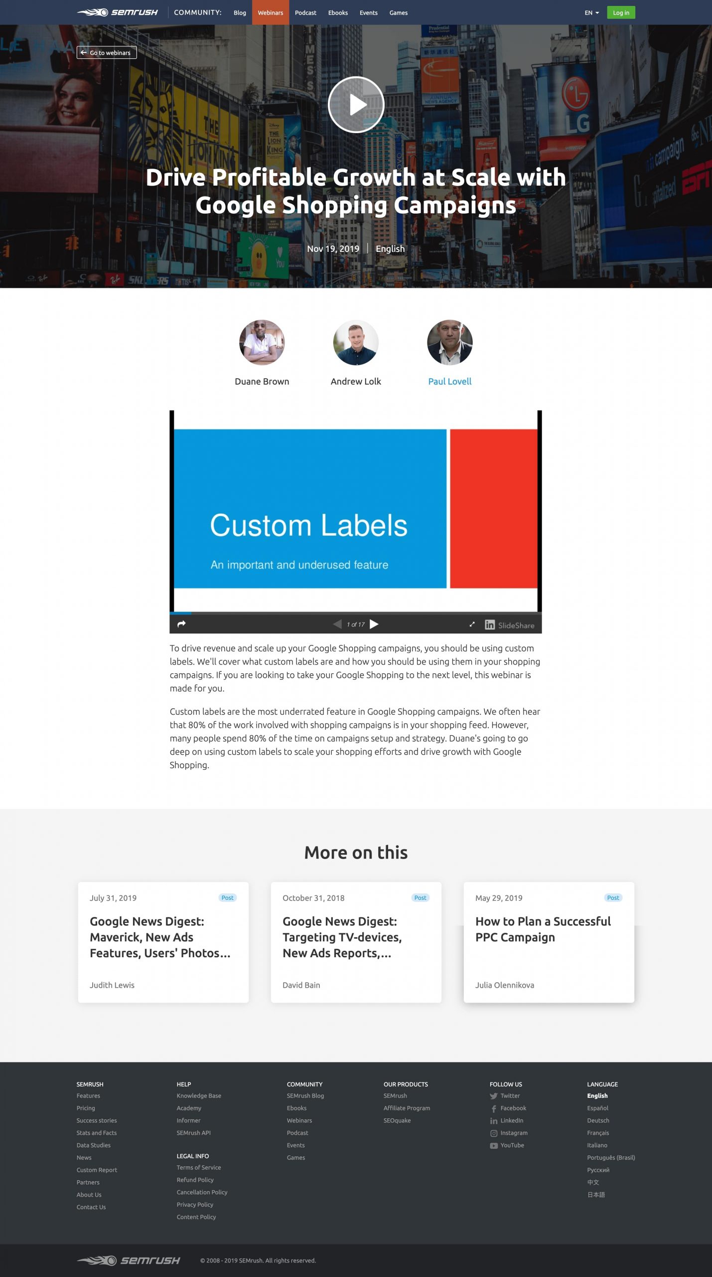
What this webinar registration page does great
- Headline – Great work with a clear and benefit-driven headline
- CTA button – The button colour stands out and entices you to click
- Expert content – The copy gives the impression that experts created this webinar and it’s intended for an expert target audience
- Questions submissions – A second way to capture emails and get visitors engaged
What could be improved
- The hero section is distracting – The background image is very busy and distracting on the eye. It doesn’t contract well with the white text
- Header and footer navigation – Unnecessary for a webinar registration page
- Missing host details – Doesn’t feel personable or let you know who they are and why attendees should listen to them
- Dense paragraphs – The copy is hard to read and they should break it up into sections
- No countdown – This was a live webinar so a countdown time adds urgency and can help increase conversions
Page load time: a meager 4.2 seconds. Not terrible, but there is some work to do.
Mention
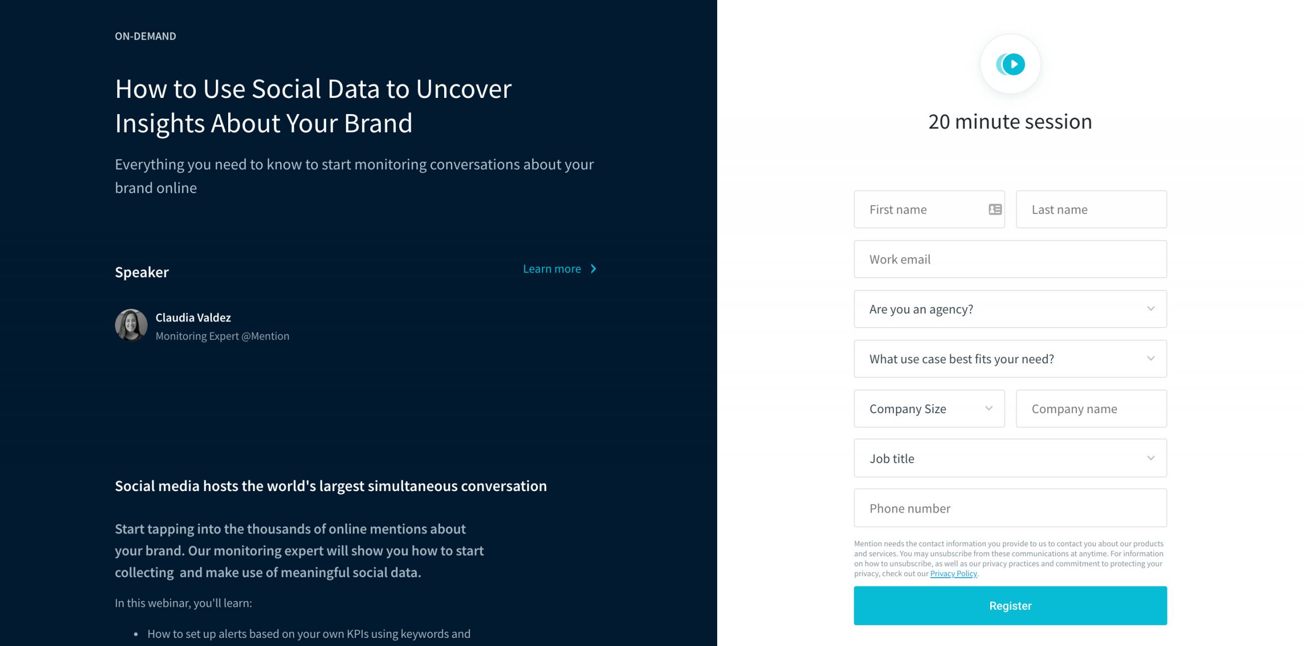
What this landing page does great
- Headline – bold and catches your attention
- Webinar length – Clearly identifies how long the webinar will be, which is a key consideration for any busy person
- Small paragraphs – When you break copy into smaller chunks like this, it is easy to read
- Bulleted benefits – Clear to see what visitors will get out of the event
- Unique layout – Interesting and different look to most webinar registration pages which makes it stand out
What could be improved
- Layout functionality – The right section with the form scrolls but could be static. But instead, it scrolls awkwardly and is not aligned to the centre of the screen
- Lack of responsiveness – The form comes first on mobile. The best practice is that it should follow the value proposition
- Extensive sign-up form – There are too many questions. Like asking for a phone number and ugly dropdowns are large. It asks too much which you could enrich with another solution
- Host info – Lacks detail and personality of the presenter. The dedicated host section only states that the host is an account executive… so sales. Great.
- Spacing – The spacing between sections is large and could be closer together to look more natural.
Page load time: 3.7 seconds. Again decent but there is room for improvement.
HootSuite
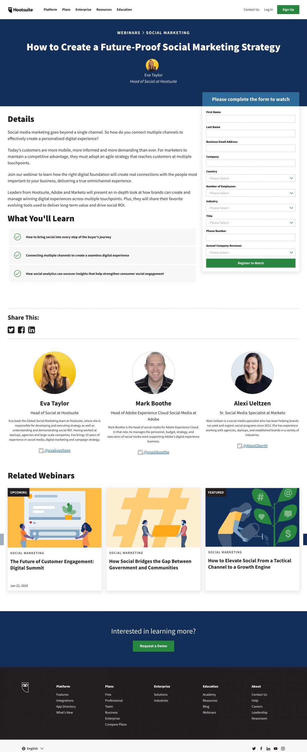
What makes this a well-designed landing page
- Large headline – It makes it clear and obvious what the webinar is about
- Organised Details – This section is broken into smaller paragraphs that make it easy to read
- What you’ll learn – Stands out and calls out benefits making for compelling reading
- The hosts – Extensive details about each host that helps you buy into them as people
- Responsive form – The form sticks to the top of the page when scrolling. This is awesome as it means that it’s always accessible to sign up. This can have a big impact on conversion rates
What could be improved
- Header and footer nav links – There is plenty of chances to leave the page
- Extensive form – Far too many needless questions and will lower registration rate. The extra qualification will not make up for the loss of sign-ups
- Details ask a lot – It’s a big block of text, they could break it into smaller sections and be easier to read
Page load time: 6.6 seconds. Frankly, this is too slow and misses some technical best practices.
Sam Ovens – Consulting.com
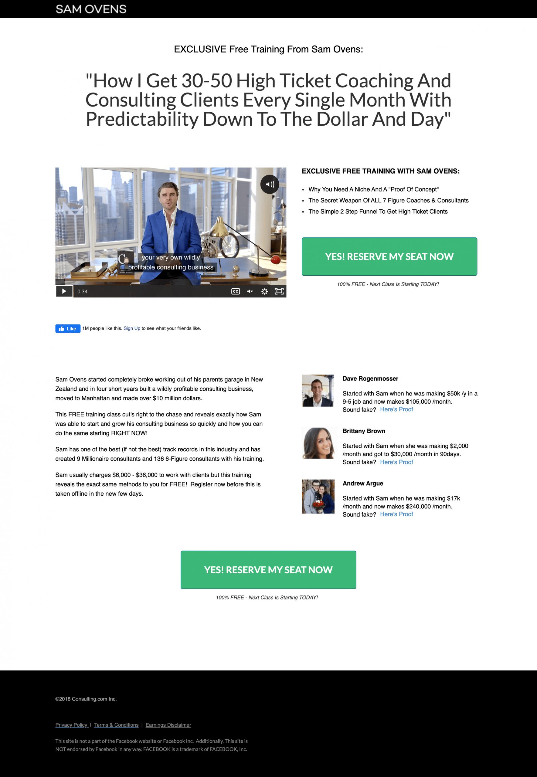
Why this is a great landing page design
- Impressive headline – The headline feeds into the intent of why a user would be on the page
- CTA button – Great contrast with the page and interesting call-out
- Social proof – Several testimonials showing it’s worth attending
- Personable hero video – The video interacts with the user directly making it human and convincing
- No outlinks – There is no opportunity to leave the page by clicking.
What could be improved
- Text size – The text is very small and hard to read
- Sensationalist copy – The copy is sensationalist and doesn’t feel very trustworthy
Page load time: 25.1 seconds. Wow, that’s a surprisingly slow time.
Invision
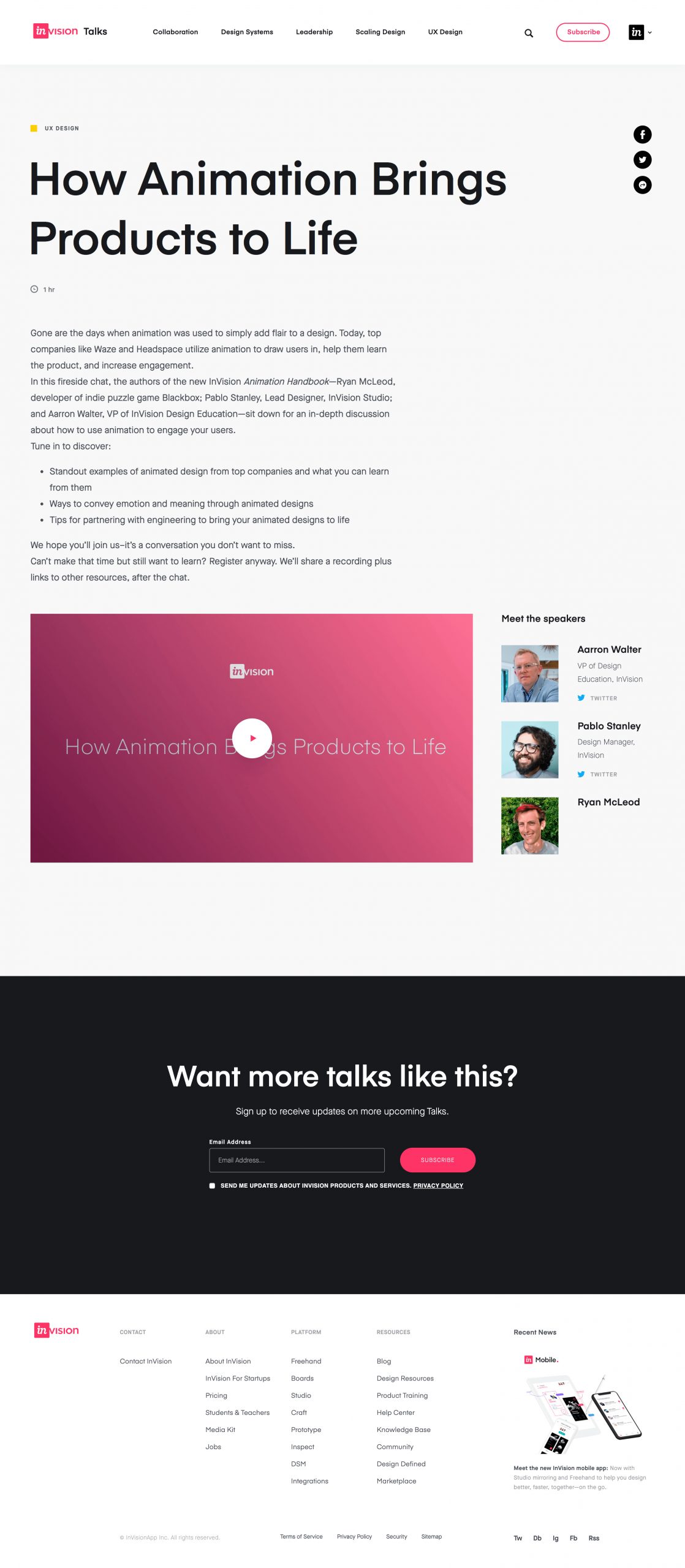
What this page does well
- Bold headline – You can’t miss it! It literally takes up most of the page
- Bulleted list – I like the “You’ll discover” intro and list of benefits. It’s more exciting than “what you’ll learn”
- Attractive signup form – The form is more interesting than most and provides even more benefits. It makes the process more personal and likely increases conversion rates
- Video Player – The player connects users with what they’re on the page for… to watch something
- Hosts – Great images all looking you in the eye which research has shown will help conversions
What could be improved with this template
- No Clear CTA – There is no button to register, only the play button which isn’t obvious to click and can be a bit confusing
- Header and footer nav – Another site giving users an easy way to leave the page without converting
- Chunky paragraphs – They should break the content into smaller chunks for readability
- Compactness – They’ve squashed the content into a small section and could do with space to breath
Page load time: 7.1 seconds. For how minimal this page is, it’s surprisingly slow.
What are the best webinar landing pages you’ve seen?
These are some webinar landing page examples from well-known brands and even they get things wrong.
It’s now your turn to build your own landing page and use the comments I’ve shared here to help you design it.
